-WebP.webp)


What is a Design Brief? Understanding Visual Language and Elements of Design

The Journey of Design: From Brief to Final Product
At a Glance: What This Article Covers
This article follows celebrity designer Pamela Krishnan, Pam; as she opens her old Design Development Journal and walks readers through one of the most defining projects of her early career: a commissioned gift collection for an international sustainability-focused NGO, designed entirely in line with the Autumn Winter 2008-09 colour and style forecast.
Through Pam's journal entries, the article explains the complete, step-by-step process of moving from a design brief to a final product line: a journey that every design student, creative professional, and craft enthusiast will find both practical and deeply relatable.
What is a Design Brief? A design brief is the written document that sets the direction for any creative project. It defines who the product is for, what it must achieve, what values it must reflect, and what constraints it must work within. Reading a brief carefully, word by word; is the very first act of design.
What is Visual Language of Communication? Just as spoken language uses words and grammar to convey meaning, design uses visual elements: colour, line, texture, shape, pattern, and form; to communicate without words. Every object tells a story before it is touched or labelled. Choosing the right visual language means ensuring that every design decision serves the message of the brief, not the personal preference of the designer.
How do the Elements of Design help decode a Design Brief? The elements of design; colour, texture, line, pattern, form, shape, and material - are the building blocks of visual language. Once a designer understands what a brief is asking the collection to say, the elements of design become the tools that say it. Each element is shortlisted and justified against the requirements of the brief, not chosen arbitrarily.
How does a Colour and Style Forecast influence a Design Collection? A seasonal colour and style forecast signals which colours, textures, silhouettes, and materials are relevant for a given period.
What are the steps in the design process from brief to final product line? The article walks through seven documented steps: reading the brief as a code; defining the visual language; shortlisting design elements; conducting research through primary and secondary sources; sketching and proposing a product range; testing each product against the brief; and presenting the collection with the thinking intact. Each step builds on the last.
What was the final product line and how did it satisfy the brief? Seven textile craft products were proposed — a hand-embroidered journal cover, a Kantha-quilted laptop sleeve, a hand block-printed silk scarf, a woven tapestry wall hanging, a felt and embroidery brooch set, a handloom tote bag with appliqué detail, and a hand-tied macramé key fob. Each product was designed as a direct visual answer to the brief: innovative, appropriate, rooted in textile craft excellence, aligned with sustainability values, and dressed in the AW 2008-09 palette.
Who is this article for? This article is useful for fashion and textile design students, design educators, creative professionals, craft enthusiasts, and anyone curious about how professional designers translate a written brief into a cohesive, considered product range.
As always, let's start with a story!
The omemy community has been on fire lately. The curious, enthusiastic, ever-so-brilliant omemy audience has been sending in questions faster than a seamstress finishing a deadline hem! And Pamela Krishnan, celebrity designer extraordinaire and omemy's favorite creative compass, has been loving every moment of it. Between answering queries on elements of design, principles of fashion, and the mysterious world of primary and secondary sources, Pam has found herself doing something rather unexpected: time-traveling.
Not literally, of course! But somewhere between answering your questions and sipping her third cup of chai, Pam found herself reaching for an old, slightly battered journal on the bottom shelf of her studio bookcase. The kind of journal that smells of memories and graphite. The kind you don't throw away.
It was her Design Development Journal; a habit she had cultivated long before the awards, the runway shows, and the celebrity clientele. Back when she was simply a young designer climbing the ladder, one collection at a time. A lifelong learner, Pam had documented every step of every collection she had ever developed—the thinking, the wrestling with ideas, the dead ends, and the breakthroughs. And one particular entry stopped her in her tracks.
The year: 2008. The project: the one that changed everything.

The Project That Made Pam
An international NGO working towards promoting the sustainable use of textile products was organizing a prestigious awards event. The event was to celebrate pioneers in the field of textile craft; individuals who had not only created objects of breathtaking beauty but had done so while treading lightly on the planet. These were the designers, artisans, and craftspeople who understood that creativity and responsibility are not opposites... they are, in fact, the finest of partners.
The NGO approached Pam with a very specific ask: propose 6-7 textile products that could be presented as gifts to the award recipients, alongside the certificate and medal.
Now, before you think, oh how lovely, a gifting project!... pause for a moment and consider the weight of this commission. These gifts were going to designers. Creative people with trained eyes and high standards. People who could spot a lazy design decision from across a room. The fear of judgment was enormous. And there was no room for vague or generic — there was a brief. A very specific one.
"Some innovative, appropriate gifts in textile crafts that reflect the personality of creators of design excellence and the values of sustainability, in line with the style and colour forecast for Autumn Winter 2008-09."
This could make her or break her. And she knew it. So, Pam did what she always did. She opened a fresh page in her journal, picked up her pencil, and started at the very beginning.
Journal Entry 1: Understanding the Brief
"Before you design a single thing, you must understand every word of the brief as if it were a code to be cracked."
Pam underlined every key phrase in the design brief and asked herself a pointed question against each one:
"Innovative" → Not the obvious. Not the expected. Push the boundary.
"Appropriate" → Suitable to the occasion, the recipient, the purpose.
"Textile crafts" → Must be handcrafted or craft-led, not mass-produced. That's the point.
"Reflect the personality of creators of design excellence" → These are creative, skilled, aesthetically aware individuals. The gift must feel worthy of them.
"Values of sustainability" → Materials, process, and philosophy must all echo the NGO's core mission.
"In line with the style and colour forecast for AW 2008-09" → Not timeless in a generic way; timely and specific.
She noted in her journal: "Every word in a design brief is a design decision waiting to be made. Never skim a brief."
Journal Entry 2: What Is Visual Language of Communication — and Why Does It Matter?
Before Pam put pencil to paper for a single sketch, she paused to define her Visual Language of Communication.
Now, this is a concept that designers live by but rarely explain in plain terms—so let's do that here. Just as spoken language uses words, grammar, and tone to communicate ideas, design uses visual elements: colour, line, shape, texture, pattern, and form; to communicate without words. This is the Visual Language of Communication.
Every object you see communicates something before you even touch it or read its label. A product in muted, earthy tones with a rough, handwoven texture says "natural, conscious, handcrafted" without uttering a single syllable. A sleek black box with metallic gold accents says "luxury, precision, exclusivity." The visual elements are doing the talking.
For a designer, choosing the right visual language is not about personal preference; it is about alignment with the brief. The visual language must serve the message. And in Pam's case, the message was clear: sustainability, creative excellence, craft, innovation... dressed in the palette and silhouette of Autumn Winter 2008-09.
Her journal note reads: "Before I decide what to make, I must decide what I want these objects to SAY. Then I find the visual elements that say it."
Journal Entry 3: Decoding the Brief Through Elements of Design
With the brief decoded and the concept of visual language firmly in mind, Pam moved to the most critical step: shortlisting the elements of design that would form the visual vocabulary of this collection. She went through each element with the brief in mind:
Colour
This was non-negotiable. The brief explicitly asked for alignment with the AW 2008-09 colour forecast. Pam pulled out her forecast references. The season leaned into a palette of deep, organic, earthy richness: warm burgundies, forest greens, burnt siennas, deep teals, and the occasional accent of aged gold. No neons. No pastels. These were colours rooted in the earth, in autumn leaves, in hand-dyed indigos left to dry in the winter sun. Perfect for sustainability. Perfect for craft. The colours practically wrote the brief themselves.
Texture
If colour spoke the season, texture spoke the philosophy. Sustainability and craft together demanded rich, tactile, handcrafted textures; the kind you want to reach out and touch. Woven surfaces, embroidered depths, knotted details, felted warmth. Texture was going to be the heart of this visual language. Smooth, machine-finished surfaces were out. The imperfect beauty of the human hand was very much in.
Line
The style forecast for AW 2008-09 favoured organic, flowing lines over sharp geometric precision... forms inspired by nature, by movement, by the unhurried pace of a craftsperson at work. Pam made a note: "No hard edges. Let the lines breathe."
Pattern
Given the sustainability theme and the craft-centred recipient profile, culturally rooted, artisan patterns felt most appropriate. Motifs drawn from traditional embroidery styles, weaving traditions, or organic natural forms; the kind of patterns that carry history in their threads.
Form & Shape
The products needed to be functional; these were gifts, not showpieces... but also beautifully considered in their form. Compact, purposeful, elegantly proportioned shapes that felt designed, not accidental.
Material
(the silent element) Not always listed in textbooks, but Pam always added it to her design vocabulary: the material itself communicates. For this brief, only natural, sustainable, upcycled, or ethically sourced textiles would be considered. Khadi, organic cotton, handloom fabrics, recycled or natural fibres; these materials were the brief made tangible.
Her journal note reads: "The visual language for this collection = deep earthy AW palette + rich handcrafted textures + organic flowing lines + traditional artisan patterns + purposeful forms + natural/sustainable materials. Every product must speak this language fluently."
Journal Entry 4: Research, Reference & Inspiration
Armed with her visual language, Pam began gathering references. She returned to her primary and secondary sources (and yes, omemy readers, you'll remember that conversation!). She studied traditional craft techniques from across the world... Kantha quilting, Chikankari embroidery, block printing, tablet weaving, felt-making. She visited craft markets, flipped through textile archives, and spent an afternoon at a heritage textile museum. She made mood boards. She collected fabric swatches in her AW palette. She pressed autumn leaves between journal pages for texture inspiration. She was not collecting *things to copy*; she was collecting *things to be inspired by.*
She noted: *"Good research doesn't give you answers. It gives you better questions."*
Journal Entry 5: The Final Product Line: Where Visual Language Meets Brief
After weeks of sketching, sampling, and second-guessing, the collection began to take shape. Six products. Each one a fluent speaker of the visual language she had defined. Each one an answer to the brief. Here is how Pam's journal documented each product and why it worked:
Product 1: Hand-Embroidered Journal Cover (Hardbound, Fabric-Wrapped)
The Visual Language at work: Deep teal handloom fabric base with hand-embroidered motifs in burgundy and aged gold, using traditional chain stitch and satin stitch. Organic botanical motifs; leaves, vines, seed pods.
Satisfying the Brief: A journal is perhaps the most intimate gift you can give a creative person... a space to think, sketch, and dream. The hand-embroidered surface is a direct nod to textile craft excellence. The use of handloom fabric and natural threads honours sustainability. The AW palette is present in every thread. And the act of giving a journal to a designer who has spent a lifetime filling them? Poetic.

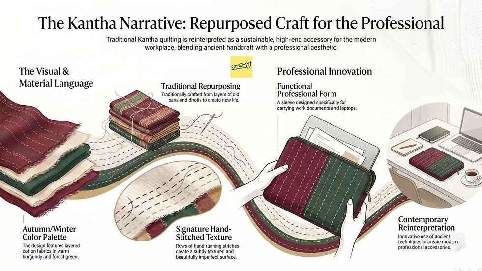
Product 2: Kantha-Quilted Laptop/Document Sleeve
The Visual Language at work: Layered repurposed cotton fabrics in warm burgundy and forest green, finished with the signature running stitch of the Kantha tradition—rows upon rows of hand stitching creating a subtly textured, beautifully imperfect surface.
Satisfying the Brief: Kantha, by its very definition, is a sustainability story; traditionally made from layers of old saris and dhotis, stitched together to create new life. The functional form (a sleeve for carrying work) speaks directly to the professional context of the recipient. The handcraft is evident and respected. The AW palette is woven into the very fabric. Innovative? In its reinterpretation of an ancient technique into a contemporary professional accessory—absolutely.
Product 3: Hand-Block Printed Silk Scarf
The Visual Language at work: Lightweight organic silk in warm sienna, hand-block printed with a repeating geometric-meets-botanical motif in deep forest green and aged gold. The edges hand-rolled and finished.
Satisfying the Brief: A scarf is personal; it is worn, it is felt against the skin, it travels everywhere with its owner. For a creative professional, a beautifully crafted scarf is not an accessory; it is a statement. The block-printing process is rooted in artisan tradition. Organic silk and natural dyes anchor the sustainability ethic. The AW palette shimmers through the print. And the fact that every block-printed piece is unique, no two exactly alike, makes it a fitting gift for individuals who have dedicated their lives to uniqueness.

Product 4: Woven Tapestry Wall Hanging (Small Format)
The Visual Language at work: A hand-woven wall hanging in a warm palette of burnt sienna, deep teal, and natural undyed wool; featuring an abstract woven pattern inspired by cross-cultural weaving traditions. Mounted on a driftwood rod with natural jute ties.
Satisfying the Brief: For creative people who fill their spaces with meaning, a piece of wall art is among the most considered gifts possible. A hand-woven tapestry IS textile craft; it is the brief made object. The use of natural, undyed, and sustainably sourced wool fibres speaks directly to the NGO's ethos. The abstract woven pattern allows each recipient to find their own meaning in it. The driftwood and jute finishing details reinforce the organic, earthy visual language. This piece does not just satisfy the brief; it celebrates it.

Product 5: Felt and Embroidery Brooch Set (Set of 2)
The Visual Language at work: Small-format felt brooches in deep teal and burgundy, hand-embroidered with French knots and bullion stitches in aged gold thread. Organic forms: abstract leaf shapes, seed forms, botanical suggestions.
Satisfying the Brief: Small in size, enormous in craft content. The brooch set is wearable textile art... and what better gift for a textile craft awardee than something they can wear at the very event? The hand-embroidery is meticulous and visible, communicating the value of skilled handcraft. Felt is a wonderfully sustainable material; minimal water, minimal waste, biodegradable. The AW palette is concentrated and impactful in the small format. And the set of two means the recipient can share... a quietly generous touch.

Product 6: Handloom Cotton Tote Bag with Appliqué Detail
The Visual Language at work: A generously proportioned tote in natural undyed handloom cotton, featuring a hand-cut appliqué panel in forest green and burnt sienna fabrics. The appliqué motif; an abstract representation of hands at work, is finished with simple but deliberate blanket stitch in aged gold thread.
Satisfying the Brief: A tote bag is the anti-fast-fashion accessory: functional, reusable, quietly radical in a world of single-use everything. The undyed handloom cotton is sustainability made physical. The appliqué technique is a textile craft in itself... time-consuming, hands-on, human. The motif of hands at work is a direct visual homage to the award recipients and what they do. The AW palette runs through the appliqué panel in deep, rich tones. And a tote bag that is beautiful enough to carry always? The most used gift of all.

Product 7: Hand-Tied Macramé Key Fob / Bag Charm
The Visual Language at work: Hand-knotted macramé in natural cotton twine, with small accent beads in terracotta and deep teal. The knotting pattern is a combination of traditional square knots and spiral half-hitches; a small but deeply crafted object.
Satisfying the Brief: Small but significant, the macramé key fob is a piece of craft that the recipient will handle every day. The natural cotton twine has zero pretence; it is honest, simple, sustainable. The knotting itself is the craft. The terracotta and teal beads speak the AW palette in miniature. And there is something wonderfully democratic about a craft that requires nothing more than fibre and the knowledge of a knot, a reminder that great design does not always require expensive materials, only skilled, intentional hands.

Journal Entry 6: Presenting the Collection
When Pam presented this collection to the NGO, she didn't just show them the products. She walked them through the visual language first; the palette, the textures, the craft techniques, the design decisions; and then showed them how every product was, in essence, a direct visual answer to the brief.
The NGO team was quiet for a moment. Then one of them said, "Each of these objects tells the story we want to tell."
That, Pam wrote in her journal that evening, was the greatest compliment a designer can receive. Not *"how beautiful"*... but *"this tells our story."*
The Design Development Process, Summarised
For those of you who learn best with a clear map, here is the journey from brief to product line, as documented in Pam's journal:
Step 1: Read the brief like a code. Underline every word. Ask what each phrase demands of the design.
Step 2: Define your Visual Language of Communication. What must this collection SAY, before you decide what it will BE?
Step 3: Shortlist your Elements of Design. Which elements: colour, texture, line, pattern, form, material; will carry the visual language? Let the brief and the season's forecast guide you.
Step 4: Research. Go to primary and secondary sources. Build mood boards. Gather references. Let curiosity lead.
Step 5: Sketch and propose. Develop a range of products, each one a fluent expression of the visual language you have defined.
Step 6: Test every product against the brief. Can you clearly articulate how each design decision satisfies each requirement? If not, redesign.
Step 7: Present with confidence: not just the products, but the thinking behind them. The story of how you got there is as important as the destination.
A Note Before You Go
If you have read this far... and we mean every word, every journal entry, every product description, then congratulations are genuinely in order. You have just completed a learning journey that most design students take an entire semester to absorb. You did it in one sitting, fueled by curiosity and, hopefully, a decent cup of something warm.
You are part of a rather select group. In a world of infinite scroll and three-second attention spans, you chose to spend your screen time on something that actually adds to you. No doom scrolling. No mindless feed. Just genuine, joyful learning... exactly the kind that Pam herself has championed her entire career.
That, frankly, is a creative instinct worth nurturing. So here is what we'd like you to do next: hit the Subscribe button below. Not because we'll flood your inbox—we won't. But because stories like Pam's journal, Maya's embroidery adventure, Nina's fabric store discoveries, and many more are being crafted right now, and you deserve to be the first to know when they arrive.
The best learners are rarely the loudest in the room. They're the ones who keep showing up, keep reading, and keep asking questions. You know who you are.
We'll see you in the next story.
OMEMY Subscribe


Comments