-WebP.webp)

Elements of Design in Fashion - It's Not About 'Beautiful', It's About 'Appropriate'!
- omemy tutorials
- Mar 23
- 6 min read
Updated: Mar 25
How do Line, Colour, Texture and Silhouette work together in a design?
As always, let's start with a story!

Sheena had dreamt of this moment for years. The acceptance letter to her dream design college had her floating for weeks. Finally, she was here; surrounded by sketch pads, fabric swatches and people who, like her, believed that fashion was the most exciting language in the world. She was ready to spend the next few years designing beautiful things. Elaborate things. Intricate things that would make people stop and stare.
Except…it wasn't quite going that way.
Every time Sheena put her heart into a design, added more detail, more embellishment, more everything: it came back with a lukewarm assessment. And yet, the student sitting next to her, who had submitted what looked like the simplest dress silhouette on the planet, walked away with a glowing review. Sheena was confused, a little deflated, and honestly, a little annoyed.
"Fashion Isn't About Beautiful. It's About Appropriate."
Then came the guest lecture. And with it, a name Sheena already knew, Pamela Krishnan, owner of one of the most celebrated celebrity boutiques in the country. Sheena had read Pam's earlier talk on fashion seasons and forecasting and had been quietly fascinated by how Pam decoded trends the way a scientist decodes data - calmly, systematically, and always a few steps ahead of everyone else.
This time, Sheena wasn't going to let the opportunity pass. At the end of the lecture, her hand shot up.
"Pam, I keep trying to make my designs more beautiful, more detailed, more worked upon. But they keep getting rejected. Simpler ones get approved. I just don't understand what I'm missing."
Pam smiled. She'd heard this before.
"Sheena, the moment you stop chasing 'beautiful' and start chasing 'appropriate', everything will change. Fashion - whether it's apparel, accessories, home textiles, craft products, or anything else that follows trends; is not a beauty contest. It's a brief-solving exercise. The design that best fits the occasion, the audience, the context - that's the one that wins. Always."
Sheena stared at her notepad. Appropriate. Such a small word for such a big shift in thinking.
"But how do I even build that appropriateness into my designs?" she asked.
"Simple," said Pam. "You go back to the basics. You learn the alphabets before you write poetry."
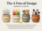
The 4 Pots of Design | Elements of Design
Pam pulled up a slide — four illustrated pots, each labelled: Line. Colour. Texture. Shape/Silhouette.
"Think of these as four pots," she said. "Every design brief you ever receive can be answered by dipping carefully into each of these pots and choosing the right option. Let's go through them one by one."
Pot 1: Line
"Lines are everywhere in design: in the weave of a fabric, in the cut of a collar, in the pattern of an embroidery. But here's the thing: every kind of line has a personality."
Straight vertical lines? Stiff, structured, business-like. Think a sharply tailored blazer or a Nehru collar running clean from neckline to hem, they immediately say formal, no-nonsense.
Curved or wavy lines? Relaxed, free-flowing, approachable. Think a flowy boho dress with a watercolour print, it's practically whispering weekend vibes.
Diagonal lines carry energy and movement.
Broken or irregular lines feel spontaneous, even edgy.
Zig-zag lines are playful, almost electric.
"Now, here's where it gets interesting," Pam continued. "Say your brief is 'formal'. You need straight lines. But what if you want a plain, minimalist dress? You don't have to slap a stripe print on it! You can introduce straight lines through a square neckline, or a structured hemline, or a collar that falls in a clean vertical drop. The line is still there — it's just speaking quietly."

Pot 2: Colour
"Colour," said Pam, "is the element everyone thinks they understand and almost everyone gets wrong in early practice."
Warm colours: reds, oranges, yellows - energise. Cool colours: blues, greens, purples - calm. But beyond temperature, colours carry associations that are almost hardwired into us culturally.
Red and green? Christmas, without you saying a word.
Yellows and oranges? Diwali, festivity, abundance.
Deep navy and charcoal black? Corporate boardroom, no further questions.
Colours also speak to specific audiences in ways that feel almost instinctive. Soft pastels: baby pinks, mint greens, buttery yellows; are universally associated with children's products, and for good reason. They communicate gentleness, innocence, and safety before the product is even picked up. Walk into any children's section of a store and the colour palette practically coos at you.
A bold, saturated red toy packaging and a pastel lavender one are speaking to entirely different buyers and both are doing their job perfectly.
And then there's the question of combination. A monochromatic outfit: varying shades of the same colour reads as considered, sophisticated, intentional. A bold contrasting combination - think a cobalt blue and burnt orange kurta; reads as vibrant, celebratory, confident.
"Neither is better," Pam was quick to clarify. "One is appropriate for a gallery opening, the other for a festive family gathering. Back to our favourite word - appropriate."

Pot 3: Texture
If line is mood and colour is emotion, texture is experience.
A smooth, matte fabric feels understated and professional. A rough, nubby weave feels earthy and artisanal. A shiny, lustrous surface feels celebratory and glamorous.
Pam gave a quick example everyone in the room could picture: "A heavily embroidered silk dupatta with mirror work shouts festivity. The same dupatta in plain cotton with kantha stitch whispers everyday elegance. Same garment, different texture: completely different personality."
And then there are pile fabrics, velvet being the queen of them all. The way velvet catches light, shifts depth as it moves, and fills the eye with what can only be described as visual abundance. It has been the fabric of royalty and luxury for centuries, and not by accident. When you drape a room in velvet cushions or line a jewellery box in it, you are not just adding texture , you are adding a statement of opulence, before a single word is spoken or a price tag is read.
And it's not just apparel. In craft products, a glazed ceramic finish versus an unglazed matte one, a silk embroidery versus a jute one: texture is what makes the hands and the eyes decide how they feel about an object before the brain even catches up.

Pot 4: Shape / Silhouette
The final pot - The silhouette of a garment OR the shape of a craft product ...is its architecture.
An A-line dress is timeless and universally flattering, it speaks of quiet femininity. A boxy, oversized silhouette is current, relaxed, gender-fluid in its sensibility. A structured fit-and-flare gown is drama, occasion, grandeur.
For craft products and textile artifacts, shape works similarly. A round, soft form in a cushion or bag communicates warmth and approachability. Sharp geometric forms: a structured box clutch, a angular lampshade; communicate precision and modernity.
Shape can also signal the end user as clearly as a name tag. That instantly recognisable Mickey or Minnie Mouse head, two round ears sitting atop a round face, shows up on children's pillows, backpacks, lunch boxes and craft products the world over. The moment a child spots that silhouette, the product has already spoken to them. No branding needed, no explanation required. The shape is the message. Designing for children? Let the shape tell them the product is theirs.
"Your silhouette is the first thing the eye sees and the last thing it forgets," said Pam. "Get the shape right, and half the brief is already answered."

The Alphabets of Design
As the lecture drew to a close, Pam left the room with one final thought.
"Learning the elements of design is like learning the alphabets of a new language. A fluent speaker doesn't consciously think about spelling, the right words just come naturally. But when you're starting out, you carefully, deliberately pick each letter from the pool, understanding its sound, its role, its place in the word."
"Right now, as a new designer, imagine those four pots sitting in front of you every time you receive a brief. Ask yourself: what line suits this mood? What colour fits this occasion? What texture tells this story? What shape serves this purpose? Pick one answer from each pot, bring them together ..... and you'll be surprised how quickly 'appropriate' starts to feel like second nature."
"And then one day," she smiled, "it will stop feeling like a checklist. It will just feel like your voice."
Sheena walked out of that lecture hall with four pots, four alphabets, and an entirely new way of seeing her sketchpad.
Beautiful, she now understood, was never really the point. Appropriate was the masterclass.